As a photographer, your portfolio website is your business card in the digital world. An online presence is necessary for showing your work to the world and reaching potential clients. That’s why it’s important for every photographer to carefully think about the design and content of their portfolio website.
Here are some tips to consider when designing your online portfolio, followed by a handful of design concepts you could choose for your site. Additionally, check out these helpful tips for TFP photography (“Trade for Prints” or “Time for Prints”). TFP sessions offer a budget-friendly way to network with others, like models, makeup artists, hairstylists, and more, while building your portfolio and benefitting everyone involved.
Portfolio Websites: Tips and Inspiration
- Keep It Simple
- Match the Design to Your Photography
- Be Selective in Choosing Your Work
- Be Easy to Contact
- Follow the Trends in Technology and Web Design
- Design Trends for Photography Websites
- Hero Images
- Grid-Based Layout
- White Space
- Personal Branding
- Original Design
1. Keep it simple.
A web design based on simplicity allows your work to stand out. It also makes it easy for visitors to navigate your website. While there are plenty of extra features you could add to a website, a simple, intuitive design is ultimately all you need to showcase your work and give visitors a positive experience on your site.
2. Match the design to your photography.
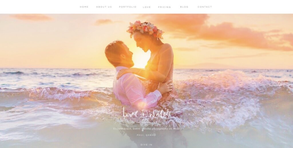
A great website design fits the work of the photographer. For example, travel photographers have online portfolios that exude adventure, while wedding photographers have websites that reflect love and joy.
Even if you specialize in several types of photography, your style will fit certain web designs better than others. If you don’t know what your style or brand is, try to figure that out before you choose a website design. Otherwise, you might spend a lot of time/money on one design, only to realize a couple months later that it doesn’t fit your business or match who you are as a photographer.
3. Be selective in choosing your work.
Your online portfolio should be your “best of,” not “the complete works of,” so be critical when selecting the photos that go on your website. As you create new work, you should update your portfolio regularly. Don’t be afraid to take out photos or experiment with the organization.
When ordering a gallery, a good rule of thumb is to start and end with your best photos, and to keep the middle varied. A visitor should leave with a good impression of your work and want to see more.
4. Be easy to contact.
Have a section dedicated to your contact information, especially if you’re looking for customers. Make it obvious where this section can be found and make the process of contacting you effortless.
Similarly, be sure to include social media on your site. This will give visitors another avenue for following, contacting, and interacting with you. It will also show that you have a strong online presence, which will come across as professional and trustworthy.
Another advantage of social media is that you can show a different side of yourself as a photographer. For example, while your portfolio website could host your professional work, Instagram would be great for more personal photos. This way, you can experiment and share photos that are personally meaningful, while still keeping your website clean and professional.
5. Follow the trends in technology and web design.
If you keep track of the portfolio websites of successful photographers, you will notice that their designs are regularly updated. One reason for these updates is that the idea of what is good design changes over time. Since aesthetics are important for photographers, it’s good to keep up with the general trends in web design. If your website is starting to look dated, it might be time to change its design.
Another reason to update your website’s design is changes in technology. Smartphones and tablets, for example, have changed the way people access websites. Nowadays, if your website’s design is not responsive, you are missing out on an opportunity to show your work to a large group of internet users.
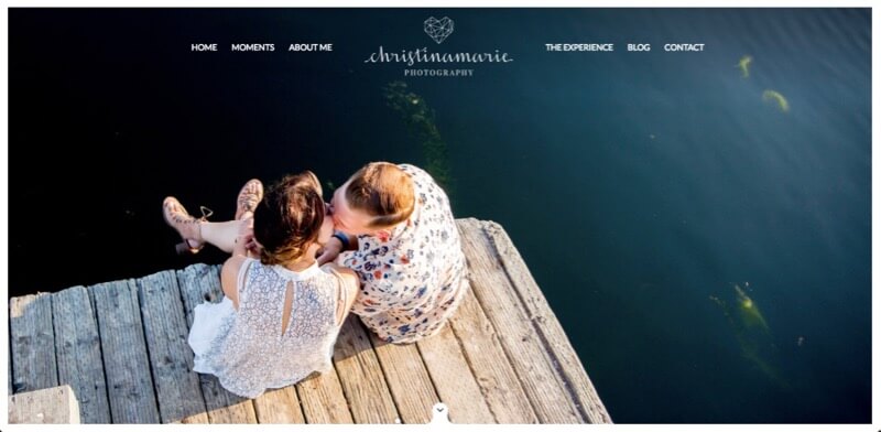
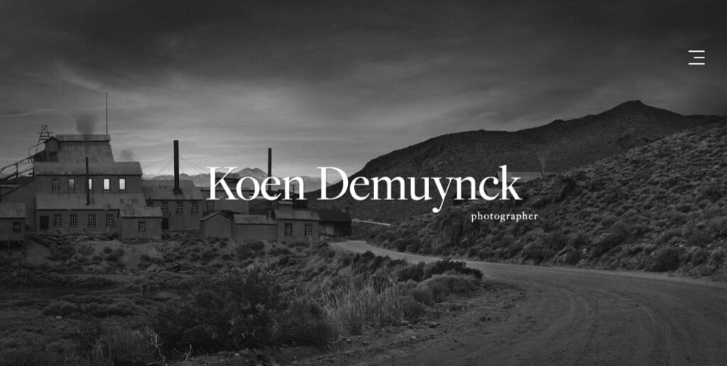
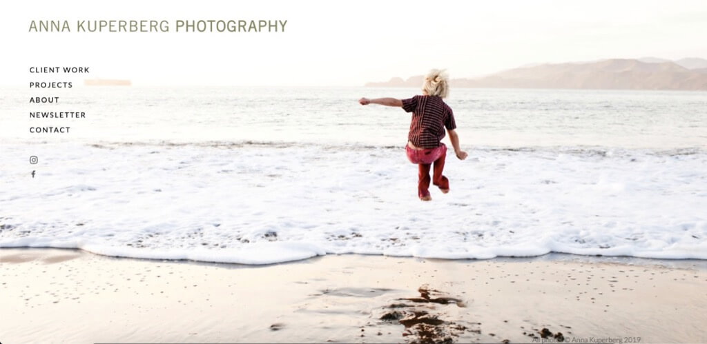
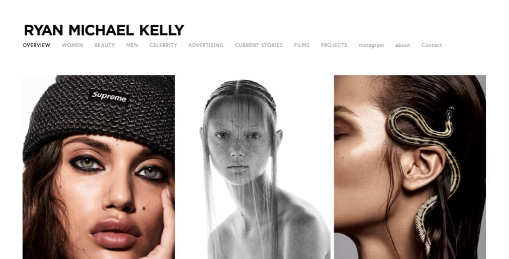
To give you an idea of what’s currently considered great design, here are some design trends to consider for your site, plus photography portfolios that demonstrate each design. As an added bonus, you get to look at some amazing photography!
Design Trends for Photography Websites
You don’t have to choose just one of the following design concepts. You can use several of them on the same site. For instance, you can have a landing page with a hero image, but then use a grid layout to showcase individual projects.
Just remember to keep it simple and stay true to your own style. If a trend doesn’t fit your brand, that’s okay! Above all, your site should be authentic and match who you are.
Hero Images
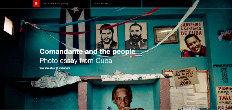
A hero image is a large, high-definition photo that dominates a site’s landing page. Hero images are meant to grab the user’s attention. After the hero image, a user can either scroll down or visit other parts of the website through a menu. As photographers specialize in images, a hero image works well with a photography site.
You should probably pick your most captivating photo for your hero image. It’s also common on photography sites to use a hero slider that cycles through multiple photos. Hero sliders are great for people that have trouble picking their best photo.
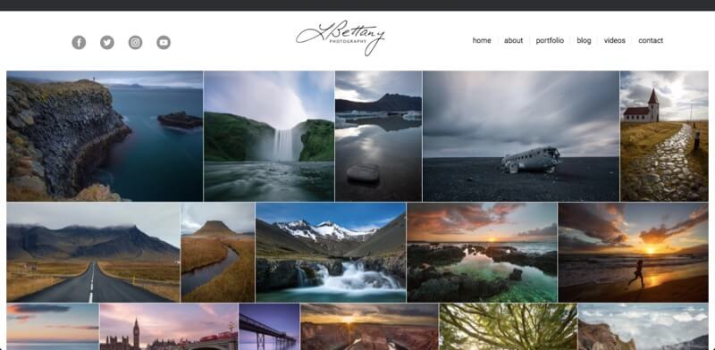
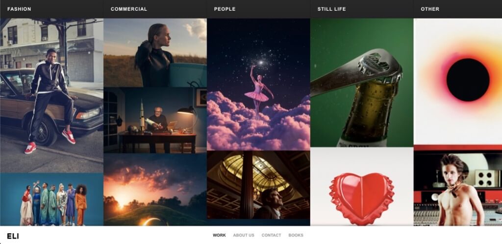
Grid-based Layout
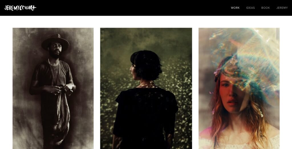
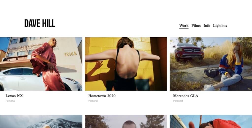
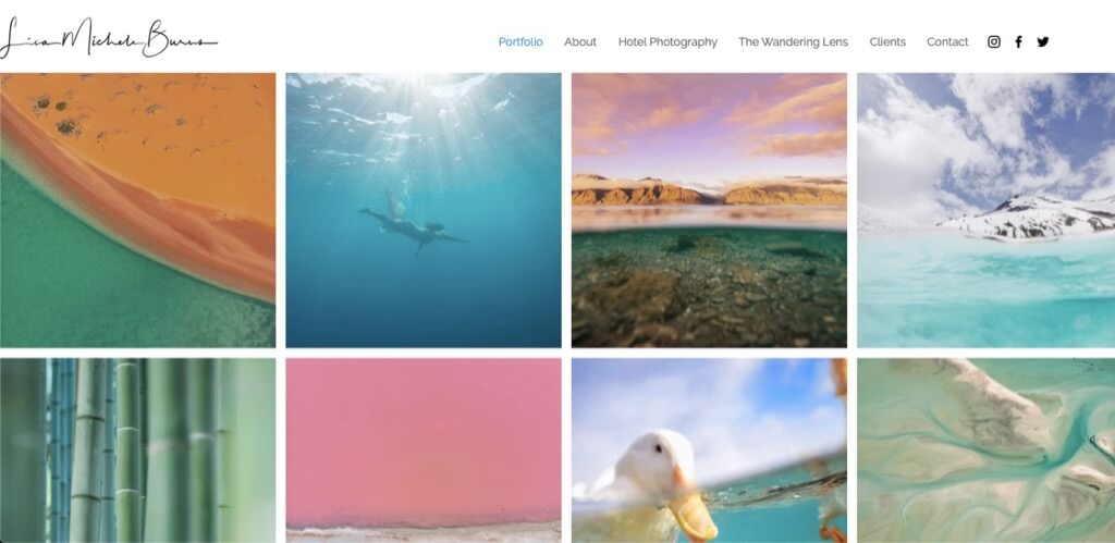
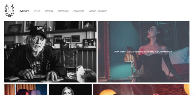
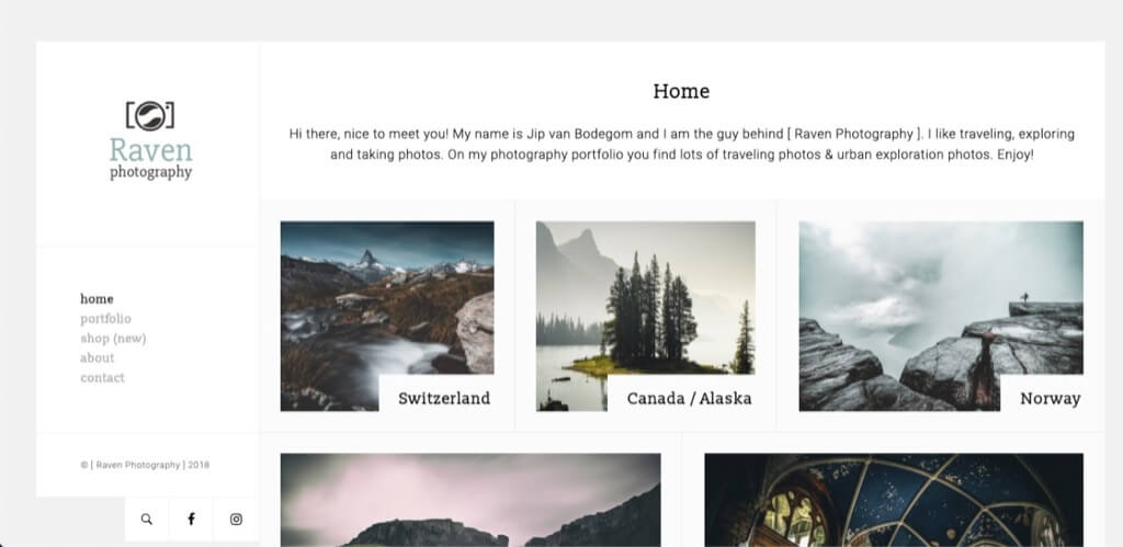
A grid-based website design (also called a card-based design or modular design) has been popularized by sites like Pinterest. In a grid design, the content of a website is broken down into individual squares. The shape and sizes of the individual squares can vary to create a more interesting design or a hierarchy in the content.
The advantage of a grid-based design is that it works well as a responsive design. By changing the layout and sizes of the tiles, the design can easily adjust to any screen size. It’s also great way for photographers to showcase a lot of their images at once.
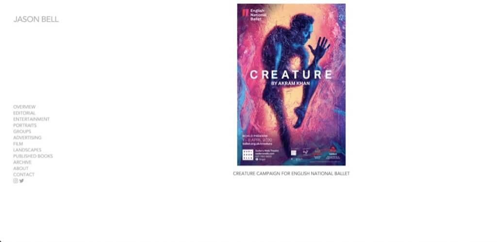
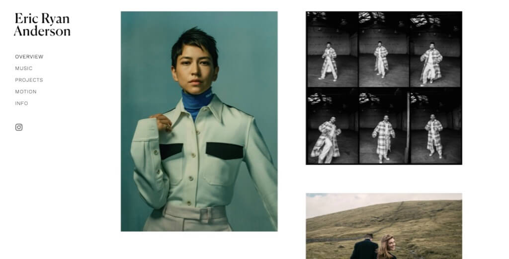
White Space
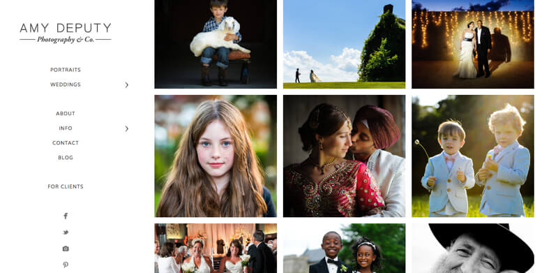
For a truly minimalist design, you can leave a significant amount of white space around your images. This design may seem counterintuitive at first, as it leaves a lot of “empty” space you could otherwise use to display images. However, all that white space will give your website a clean, professional look. It’ll also make your images stand out, framed by white.
Personal Branding
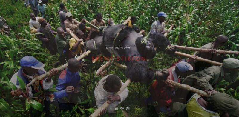
In a way, most photography websites are already a form of personal branding. Photography sites generally show the portfolio of one photographer, whose name appears prominently on the website. However, personal branding has become more important for photographers nowadays, which has affected the design and content of their websites. For instance, more sites now show a picture of the photographers themselves.
It’s also common for a photography website to have a personal blogging section. A few photographers even host podcasts, webinars, and advertise master classes on their websites. As a professional photographer, your future work depends on your personal brand. Your website’s design and content forms a large part of that brand.
Original Design
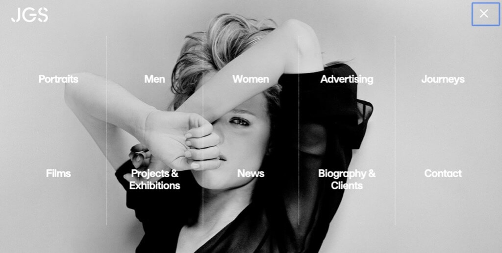
One consequence of everyone following the same design trends is that a lot of photography websites start to look the same. So, instead of using the same WordPress template as everyone else, some photographers choose an original design. The advantage of a custom design is that your website will stand out. With an original design, it’s also possible to create a unique user experience for website visitors.
If you can’t afford a completely original website design, you can opt for a custom logo instead. A distinct logo can give your website a unique look at a lower price tag. Then, you can download a design theme or template on a site like ThemeForest and insert your logo, giving the template a personal touch. You can also be creative with your typography, thoughtfully choosing a font that fits your brand rather than settling for a typical, standard font.

