Business cards date back to the 17th century, though they’ve changed a lot in 400 years. At first, they were mainly used as advertisements, handed out in public squares or markets. Called “trade cards”, they helped customers find a business at a time when streets weren’t numbered.
Trade cards were strictly for public use. In the private sphere, people in the upper classes used “visiting cards” to announce their arrival and arrange social visits. A successful businessman might have two types of cards, then. One for advertising, and one for socializing.
In the 19th century, private entrepreneurs started to hand out a new type of card, called the “business card.” This card combined the concepts of the trade card with the visiting card. It was handed out during exhibitions, presentations, and whenever personal information needed to be exchanged.
Now, business cards have become a necessity. They’re used for networking, advertising, and establishing an identity. They’re like having a profile on social media, only in real life.
For most of the 20th century, business cards looked almost identical. Many had simple, one-sided designs printed on white paper.
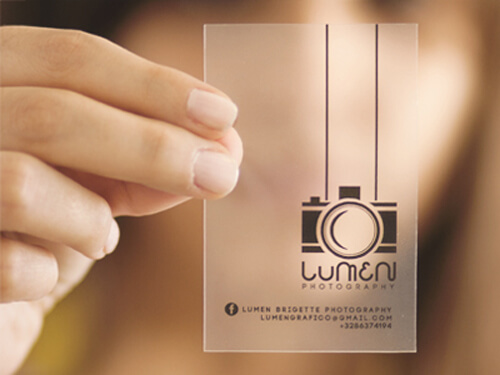 But now with the Internet, business cards have changed. They’re more thoughtful and complex in design. This change is partly because the purpose of business cards is changing. Since information is now easy to find, business cards aren’t as informative as they used to be. They’re no longer critical for success, either
So why are business cards still so common? For some businesspeople, exchanging business cards is just a habit. But for strategic entrepreneurs, it’s also an opportunity to catch someone’s eye. In an instant, a business card can communicate the look and feel of your brand. If designed well, they can make your business stand out from the rest.
For photographers, a good business card can also show potential clients that you’re a professional. It makes you look more sophisticated and serious about your career. After all, anyone can take photos, but only professionals have business cards.
However, this positive impression only applies to nice business cards. Plain, poorly-designed business cards will have the opposite effect. They’ll make you seem less trustworthy and more like an amateur.
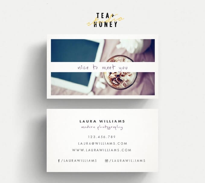
Below are 30 examples of excellent and creative business card designs for photographers. We’ve also included 6 tips for designing a business card that helps build trust and make connections in the photography industry.
Photography Business Card Designs and Tips
Invest in quality.
When you hand someone your business card, you’re giving them a snapshot of your brand. If your cards look flimsy and unprofessional, your brand will also look flimsy and unprofessional. In other words, you don’t want to cut corners when you’re creating business cards.
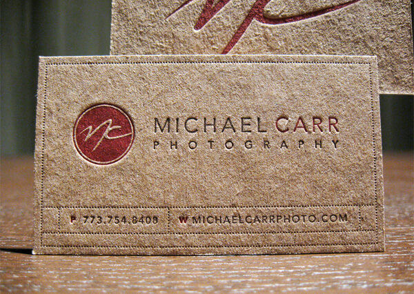
That’s not to say that expensive equals better. You can pay a lot and still end up with mediocre business cards. What matters most are the fundamentals. What paper are you using? How are you printing the cards? Are you using professional services like embossing, or going 100% DIY?
You can still create high-quality cards on a budget, but your cards shouldn’t look like they were made at home for free. Clients want to hire successful photographers, and cheap-looking cards don’t look successful.
Michael Carr Photography designed by Alexandra Daley
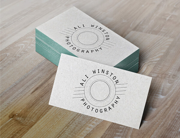
Ali Winston Photography designed by Kathryn Winston
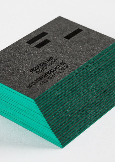
Frederik Laux Photography designed by Christian Vögtlin, ADDA Studio, and Mario Kober
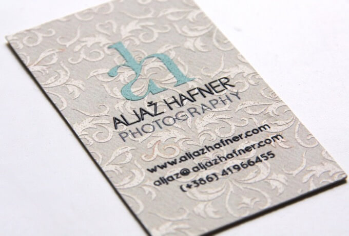
Aljaž Hafner Photography designed by Vida Iglicar
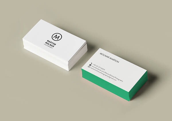
Marton Molnar Photography designed by Zsofi Szabo
Keep it simple.
More is not always better. In many ways, excellent business cards look like well-composed photos. They’re clear, uncluttered, and focused on the important elements.
If your card is starting to look like a resumé packed with details, eliminate something. Thanks to the Internet, you don’t have to put all your contact information on your card. If you list your website, phone number, and email address, clients will be able to find you.
As for social media, only add social media accounts that are necessary and up-to-date. If you regularly post on several sites, try to choose the most important one or two, not all of them. Think, “Which site best represents my portfolio?” Use that one.
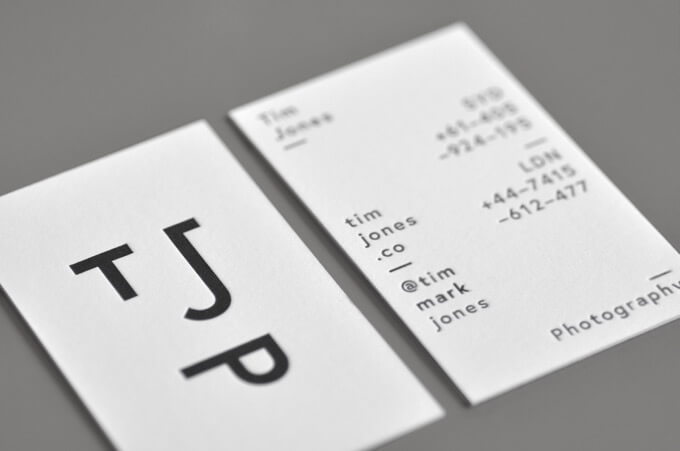
Tim Jones Photography designed by Jason Little, Olivia King, and For The People
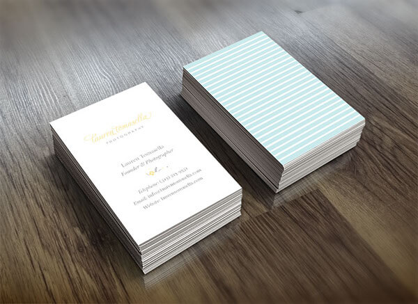
Lauren Tomasella Photography designed by Anika Samples Koehler
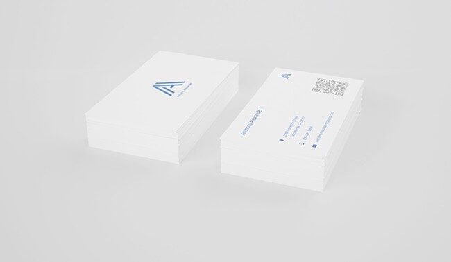
Anthony Alexander designed by Clement Porquez, Tom Gavand, and Be Graphix
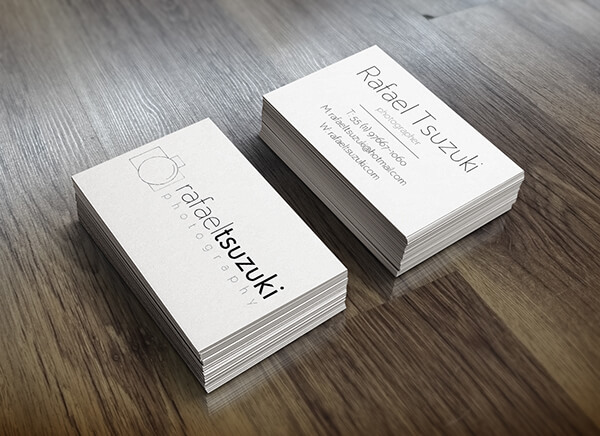
Rafael Tsuzuki Photography designed by Carolina Valentim
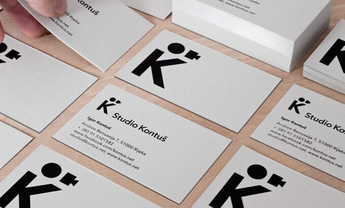
Kontuš Photography designed by Igor Manasteriotti
Think carefully about your font and colors.
Font can seem like a small detail, but it’s actually a key part of your card’s design. The right font can be a game-changer, while the wrong font can ruin your card’s look. For evidence, take a look at these 10 fonts designers love to hate.
Overused fonts like Arial or Times New Roman aren’t the best choices for a business card. Instead, choose a unique, easy-to-read font that fits your brand.
Similarly, if you’re using colors, select tones that match your brand. Color isn’t necessary, but it can be a powerful choice if you’re strategic about it.
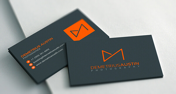
Demetrius Austin designed by Jane Kathryn Teo
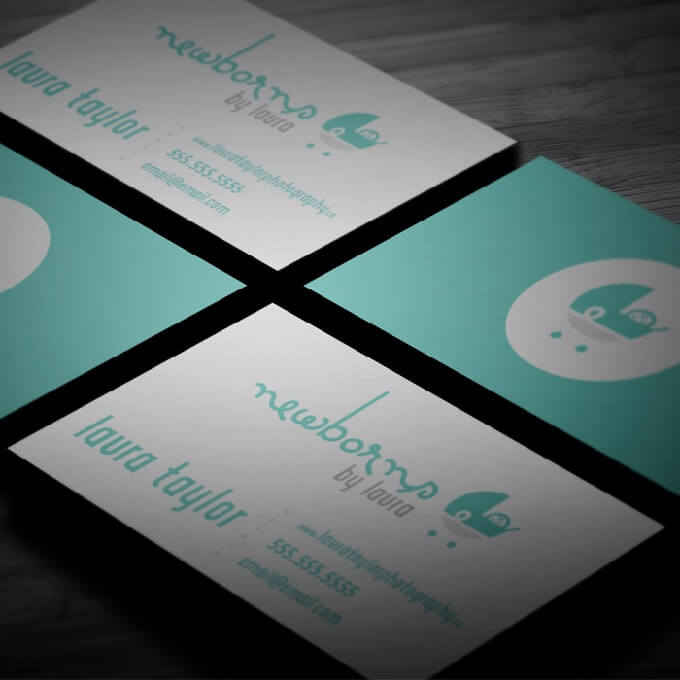
Laura Taylor Photography designed by Lili Ribeira
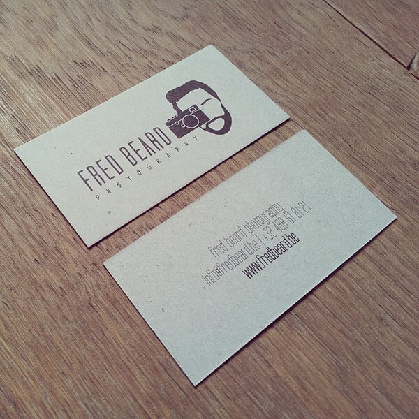
Fred Beard Photography designed by Line Godefroid
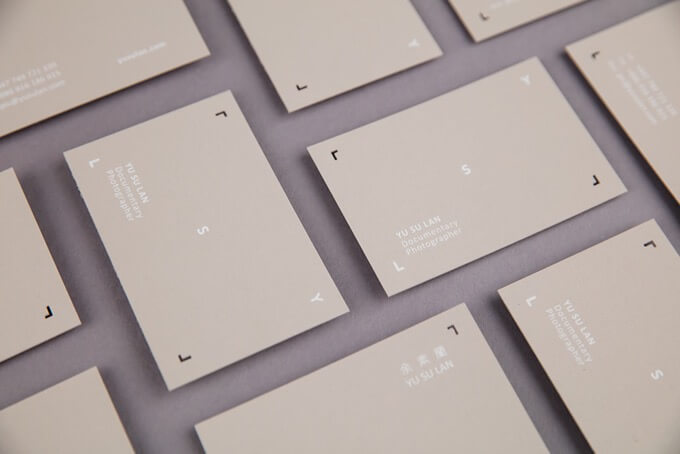
YSL Photo designed by studio moho and Li-Ting Wang
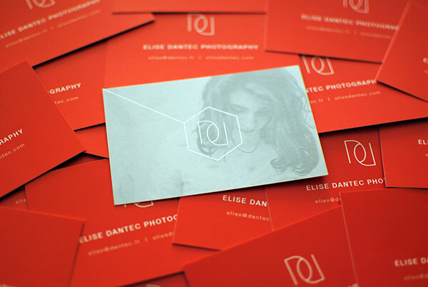
Elise Dantec Photography designed by Gerd Afforti
Showcase your work.
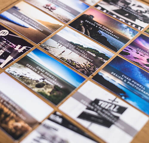
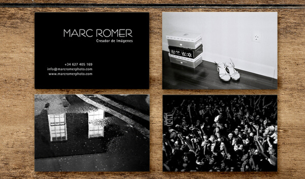
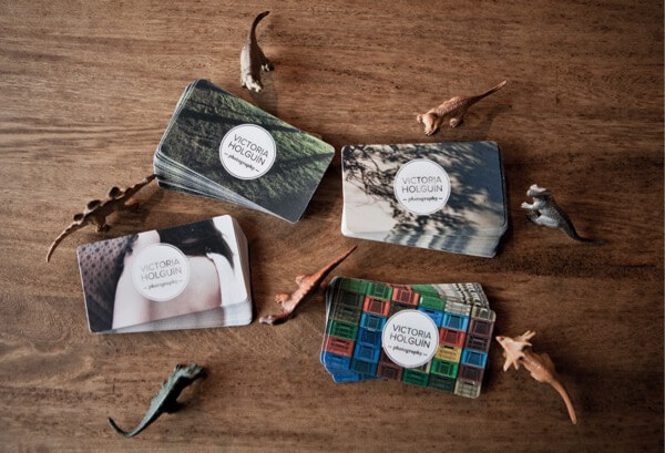
Business cards are an excellent opportunity to show clients what you’ve created. If your card includes photos you’ve taken, you can hand it out as a sample of your portfolio. It’ll give clients immediate proof that you’re a professional. And if they like the photo, they might be curious to see the rest of your work.
Thanks to printing businesses like MOO, it’s easy to include photos on your card. You just put them on the back, where there’s blank space. You can print different images on each card, too. This way, you’ll have a mini portfolio instead of a single image to show clients.
Printing different images on your cards also allows you to cater to different clients. For instance, if you shoot weddings, family photos, and professional headshots, you can have three different images, one for each audience. Then, you’ll always have the right photo for each situation.
Marc Romer Photography designed by Se ha ido ya mama
Victoria Holguín Photography designed by Liliana Ospina
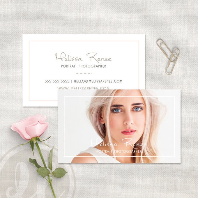
Designed by digiluxedesign
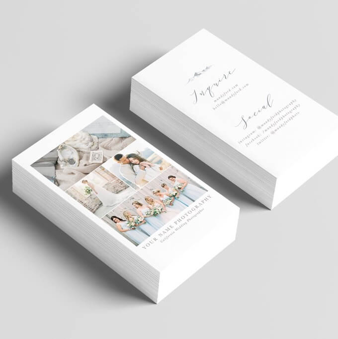
Designed by Mandy Ford Photography
Connect with your brand.
Your business card isn’t a stand-alone marketing tool. It’s part of your whole image. Like your website and social media presence, it’s a piece of something bigger – your brand.
To make your brand stronger, use the same font, colors, and logo wherever your brand appears (website, emails, social media, business card, etc). This consistency will make your brand look solid, professional, and reliable.
All of the following photographers have consistent branding. Click through to their websites, and you’ll see the same logo they used on their cards.
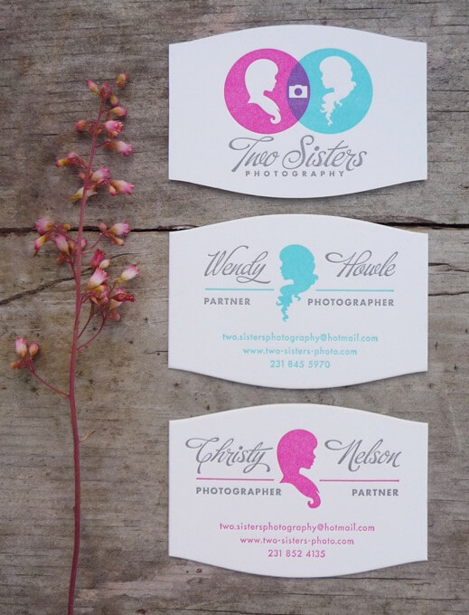
Two Sisters Photography designed by Katie Melnick, Jasen Melnick, and Fizz Creative
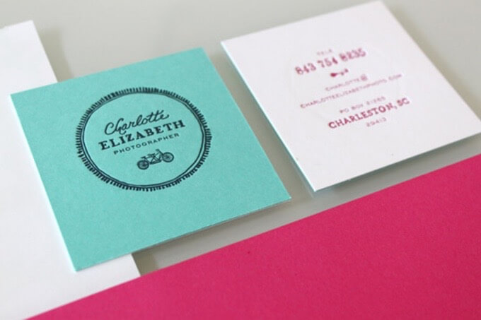
Charlotte Elizabeth Photography designed by Stitch Design Co.
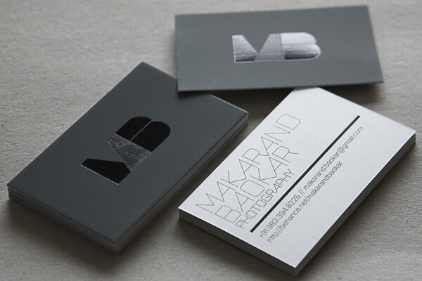
MB Photography designed by Chaiti Patel
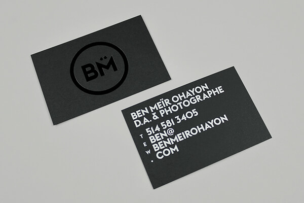
Ben Meïr Ohayon designed by 26 Lettres
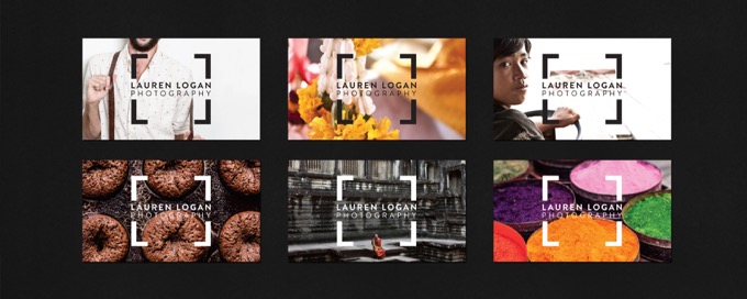
Lauren Logan Photography designed by Ellen Giles
Create a conversation, not just a card.
Many photographers would rather be taking pictures than talking with people. But if you want to run a successful photography business, you have to master conversational skills. Communication is essential in professional photography, and not just during photo shoots.
You have to talk to people to win their trust and make them want you as their photographer. Starting conversations can be hard, though, especially for introverted photographers. So, instead of talking, they use business cards like flyers. They pin them on message boards or stack them on a table, hoping the right people will see them.
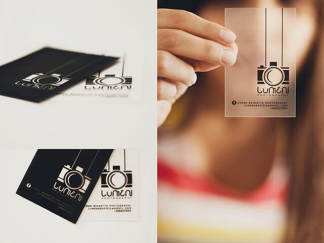
While this approach can be successful, it’s not the most effective way to build client relationships. Instead, view your business cards as a platform for conversation. A creative business card can be a natural conversation starter. Then, you won’t have to struggle as much to find the right words.
Lumen Bigott
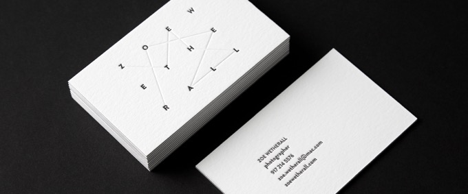
Zoe Wetherall designed by Nick Edlin
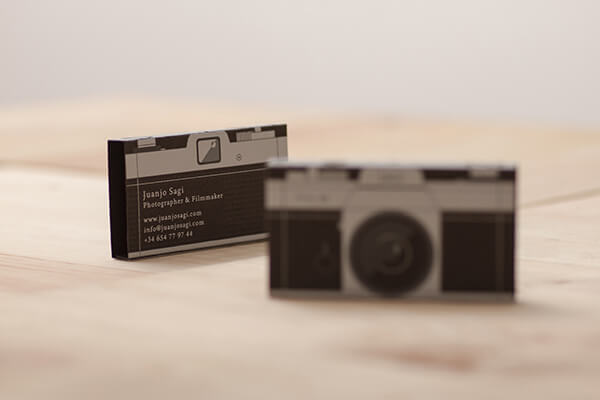
Juan Josagi designed by Doctor Zamenhof, Cranio Dsg, and Viv Campbell
Designed by The Union Press
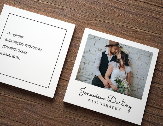
Designed by Tea & Honey Studio
